Bread and butter of marketing analytics is assessing the results of marketing programs. When measuring campaign performance, the first thing that comes to mind is the direct outcome (redemptions, sales, clicks, etc). While it is relatively easy to calculate the direct outcome, it is much harder to interpret this data in the context of whether the number is good or bad.
This is where the art of appropriate comparison comes in handy. To tell how the program impacted behavior, compare your program targets to a matched group of customers that were not targeted, called the benchmark or control group.
Bias is a situation where your benchmark group is not representative of your target group. As a result, your assessment of the results of the program can be incorrect, leading to bad decisions.
Let me be very honest here: bias can be hard to identify, even for experienced analysts. Moreover, even if you recognize the presence of bias, it is often hard to explain how and why bias was introduced. Too often, by the time you come across a “wonderful” piece of biased analysis and recognize the shortcomings, the “good” news already traveled all over the organization, and it is almost impossible to stop this train.
I have no better way to teach about bias than to provide real life examples of analyses that were biased. My hope is that the readers identify similar analyses in their own businesses and take steps to eliminate bias.
Selection Bias Due to an External Confounding Variable
Example #1. Rate Increase Subscriber Analysis.
This is a classic case of Simpson’s paradox, where we have a confounding variable that makes groups incomparable.
The goal of the analysis was to figure out how a change in the retail price of cable service impacted the disconnect rate. The disconnect rate of customers who had the rate increase was compared to that of those who did not have the rate increase. The customers were matched by product holding.
The initial analysis showed that the disconnect rate for those who had the rate increase was lower than those who did not. In layman’s terms, increasing the rates was associated with a reduction in churn.
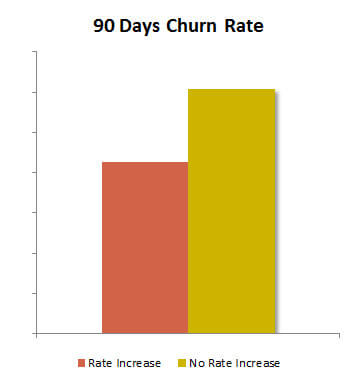
In this case, selection bias was caused by the difference in the tenure structure of the groups. Customers became eligible for the rate increase after their promotions expired, once they were paying retail rates. New customers were getting promotional rates, and thus were not eligible for the rate increase.
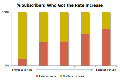
Since short tenure is strongly associated with high disconnect rates, the breakdown of the disconnect rate by tenure showed that those who had the rate increase, in fact, had a higher churn rate in every tenure group.
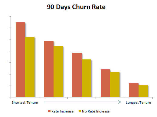
Solution: reweigh the subscriber churn rate by tenure.
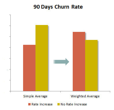
After the reweighing was done, the outcome is more indicative of what is going on with the subscriber behavior after the rate increase.
Example #2. Year Over Year Retail Ticket Analysis.
A large national retailer looked at the dynamics of its transactions by ticket (total $ per transaction) on a year over year basis. The conclusion was that small ticket purchases dropped. The analysis did not take into account a change in pricing that was caused by an increase in commodity prices of the underlying raw materials.
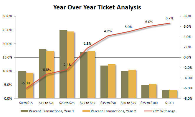
Solution: while in some businesses it is possible to adjust the sales data for price inflation, for a retailer with over 100K SKUs it was not a feasible option. The real solution is to scrap this analysis and look at the data in a different way.
Selection Bias Due to Internal Design Flaw
Example #3. Regression to the mean: the low performing stores project.
Every year a national retail chain designated the worst performing 5% of stores into a special group, which was addressed by a taskforce. Every year, the work of this taskforce was a great success, as the majority of the stores inevitably moved up from the “bottom 5” in the next year.
This phenomenon was described by Nobel Laureate Daniel Kahneman in his book “Thinking Fast and Slow”, and it is called regression to the mean. This outcome is explained by the fact that performance on a store level is not fully deterministic. There are random factors that impact performance in the short term, and these factors rarely persist for longer than a year. This is why the following year any outlier store is likely to perform closer to the mean (average).
For example, if there was road construction in front of a store, and access to the store was restricted for much of the summer, it is likely that the store performance was artificially low in the classification year, and would improve dramatically the year after.
This particular analysis also had a bonus flaw, as the performance was measured on a year over year basis. A drop in sales in the classification year would lower the starting point of the following year, thus pushing the store up the rankings, and magnifying the effect of regression to the mean.
Solution: use historical data to run a “placebo program” analysis. Select your groups in prior years when there were no special programs for underperforming stores, and see how much of regression to mean was happening historically. That can put the results in perspective.
Example #4. Biased by design: retail channel analysis.
This was the big analysis piece that was cited by a large multi-channel US retailer on quarterly earnings calls. The analysis was done in the early 2000s, and the retailer had a strong catalog business, while e-commerce was still emergent.
Here is how they described the conclusions from this analysis: the more channels the customer buys from, the more she buys. Those who buy only from brick and mortar stores spend less than those who buy from stores and the catalog, and those who buy from stores and the catalog spend less than those who buy from all three channels. The spend by channel appeared additive, and the chart looked like this:
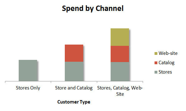
The analysis appears to make a strong statement, but is not it odd that the chart is perfectly additive?
Turns out, it was odd. The problem with this analysis was in the data that was used. The database that tracked transactions only had 1.4 transactions per identified customer, and the sample was not normalized for the total number of transactions the customer made.
Why is that a problem? That’s because any customer who shopped all three channels must have made at least three transactions. And those who shopped at least two channels would have at least two transactions. In essence, all you are doing is comparing customers who had 3.1 transactions to those who had 2.1 transactions to those who had 1.2 transactions. How is that for pitting winners against losers?
Solution: make groups representative by suppressing those with fewer than three transactions.
Example #5. Market Basket Analysis.
Market basket analysis looks into whether a customer is more or less likely to buy item B if that customer bought item A. The underlying theory is that there are different types of customers who have different market baskets, for example, A+B and C+D being most common.
Whether your market basket analysis is biased by design depends on how many “best customers” the business has in each customer grouping.
To illustrate, let’s take a numerical example of market basket analysis of three categories, A – most popular, B – medium, and C – least popular. You may notice that for any group of “customers that bought category X”, they are just as likely or more likely to buy another category than an average customer. For example, those who bought C were 80% likely to buy A, compared to 75% for an average customer.
In the table below, Customers 1-4 bought every category, Customers 5-6 bought Categories A and B, while the rest bought just one Category.
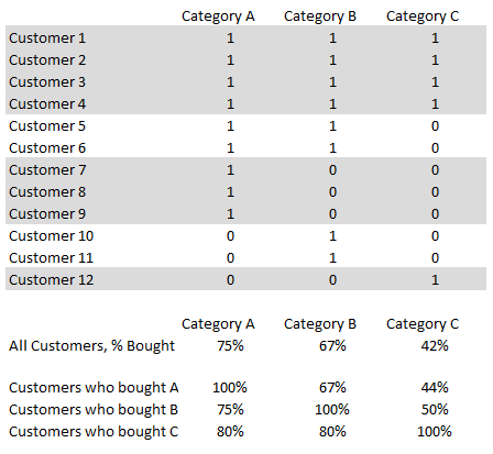
The effect is most amplified in the tail end Categories, as those who bought C appear to be more likely to buy every other category than average. This happens because the share of “best customers”, in this case, defined as those who bought all three categories, is going to be higher in the tail-end groups.
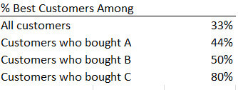
This bias often appears in statements alleging that buying a certain category of products makes customers more likely to buy other categories.
Statements like “those who bought C were also more likely to buy B, at 80% compared to 67% on average” does imply that there is some sort of causative effect of buying C on buying B, or that purchases in these categories are somehow related, which is not always the case.
Example #6. Subscribers Who Did X.
This is by far my favorite example of research design bias. It is subtle, hard to identify, produces very believable effects, and the effects always go “the right way”, i.e. showing that the program “works”.
It also appeals to people’s natural instincts on how to measure outcomes. I have seen many cases of this methodology being used. This is a great example of a self-fulfilling prophecy.
Sample research question: we ran program X for our customers over the past year, and many customers participated. Here is the list of customer accounts and dates on which they participated in X. Can you tell us if participating in X reduces churn?
Study design: customers who used program X are the treatment group. The beginning of the year is the start date, and the treatment group only includes customers active at the beginning of the year. Control group: customers who were active at the beginning of the year, are not in the treatment group, and matched by main behavior driver variables. Compare churn rates of the treatment and control group over the past year.
Result: Assuming a uniform distribution of events X throughout the year and zero impact of program X on churn rates, the treatment group will have half the churn of the control group.
Why?
The answer is survivorship bias. The treatment group is not representative of the control group in one very important way – every customer in the treated group used Program X at some point during the analysis year.
Every treatment customer must be active at two points: the beginning of the program, and when they participated in Program X. The control group customers only have to be active at one point, the beginning of the year. Presuming the usage of Program X was uniformly distributed throughout the year, the customers in the treated group, on average, had half the time to disconnect compared to the control group.
Solution: Never let your classification and outcome periods overlap. Split the classification year into a manageable number of periods, classify your customers during these periods, create a matched control group, but analyze the outcome after the classification period is closed. For example, select customers who used X in January, create a matching control group, and analyze churn in February-April.
Example #7. Comparing Former Customers to Active Customers (Disconnector Market Research).
This is something you see in subscription service market research: to understand the disconnects we survey the disconnectors and then compare the splits to active customers. Something like this:
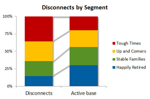
The conclusions made from this research are along the lines of: ‘Tough times’ segment is over-represented among the disconnects, thus we are losing these customers. ‘Happily retired’ segment is under-represented among the disconnects, thus, we are growing our business among these customers.
In reality, this chart is simply a reflection of how transient these groups are. Some segments have a large percentage of people changing services every month, contributing an outsize share of both connects and disconnects. The growth of the segment is a function of the net difference of ins and outs, and is not related to the turnover rate.
Let’s look at this data as ingredients of churn rate calculation:
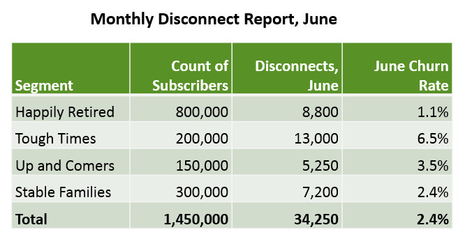
When we see this report, do we conclude that some segments are growing or shrinking at a certain rate? Generally, no. We accept that certain segments have different churn rates by the nature of the segments, and these different rates do not mean that the structure of the active base is changing. Yet, this is the same type of data as the disconnector research, simply presented differently
Conclusion: Two Types of Bias in Analytics
I reviewed many examples of bias in marketing and general business analytics, and came to the conclusion that some of them are more straightforward and easier to explain than others. Unfortunately, it’s the hard to explain kind that are more prevalent in the business world. I believe, the distinction is worth nothing.
Two main sources of bias in analytics: selection bias and analysis design bias.
- In the case of simple selection bias, the groups of analysis subjects are different due to a confounding variable external to the analysis.
- In the case of the internal design flaw, the design of the study is a proverbial self-fulfilling prophecy, as performance plays into the assignment of the groups, often through a proxy variable.
Some may wonder why there is a distinction between the two types of bias. In both cases, bias is bad, and it leads to incorrect interpretation of the data. However, let me highlight the difference for you using the following example.
Let’s say you are evaluating the results of a group of runners in a running race using average time as a metric. In the case of simple selection bias, you may get incomparable results by not taking into account an “external” variable like athletes’ gender, age, years of running experience, etc. It is fairly easy to understand why such variables are important and what you can do to eliminate this kind of bias.
However, if some circular logic in the design of your study results in comparison of top finishers against bottom finishers, no amount of reweighing on the “external” variables will produce good analysis because this type of a study is internally flawed. I have observed that many comparison setups suffer from both types of bias, and fixing one type is not going to fix the whole analysis. This is why it is the internal design bias is more common and harder to recognize.
