Churn Analysis in Excel: Step-by-Step Guide
This article will go over the following:
- Types of churn analysis that can be done in Excel
- How to prepare your own data
- How to use the Kaggle telecom churn dataset and:
- Use Excel pivot tables and charts to analyze data,
- Leverage VLOOKUP to bring additional data into the analysis,
- Provide examples of how to present the analysis result;
Churn Analysis in Excel Steps
- Identify and prepare the data. Churn analysis is built on snapshots, which show active customers and their attributes in the beginning of the period.
- Create appropriate churn flags. If your data size is too big for Excel, you can summarize this data into groups by using Active and Churned customer counts.
- Insert a pivot table and create Churn Rate calculation using a calculated field.
- Break Churn Rate down by categorical attribues to find variables that correlate with churn.
- Turn continous variables into caterogical by exploring the relationship between the attributes and the Churn Rate.
- Refine the story and create compelling visualizations.
Jump right in by watching the video demonstration of Churn Analysis in Excel:
Churn Analysis Data
For attributes of churn analysis, you will need to produce snapshots of your subscribers and their attributes at the beginning of every period, and then join the churn flag to indicate whether they became inactive during the said period of time.
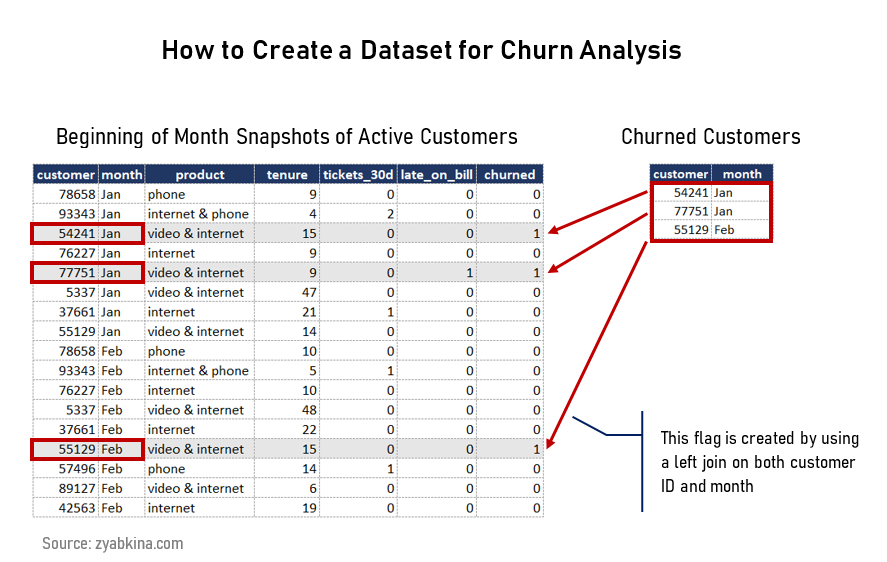
This dataset is usually produced from a database using SQL, which is the most time-consuming part. The customer attributes should be added to the snapshot and valid as of the date of the snapshot.
You can get the list of common customer variables in my article on churn analysis.
For this article, I will use the Kaggle telco churn dataset. It is similar to many real datasets in structure, other than missing time periods associated with snapshots and churn.
Churn Analysis Process
I am going to use Pivot Tables and Pivot Charts, and if you are not familiar with them, they are a great method for analyzing sets of structured data.
Step 1. Create a Pivot Table and Insert Calculated Fields
This section is full of tips and tricks. Creating simple flags and additional variables is like pixie dust when it comes to analyzing data in pivot tables. Use calculated fields, and you will get your insights even faster.
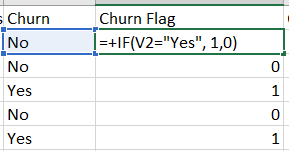
Create a Churn Flag
Add a column of 1s so you can have an easy count of accounts for every category using a sum function. This will make it much easier to calculate the churn rate in the pivot table.
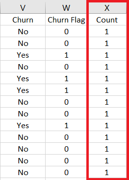
Create a Total Count Variable
Add a column of 1s so you can have an easy count of accounts for every category using a sum function. This will make it much easier to calculate the churn rate in the pivot table.
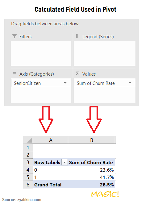
Create a Pivot Table and Add Churn Rate as Calculated Field
First, highlight your whole dataset and then create a pivot table in a new sheet (all standard options). Then, insert a Calculated Field called ‘Churn Rate’ that is ‘Churn Flag’/Count.
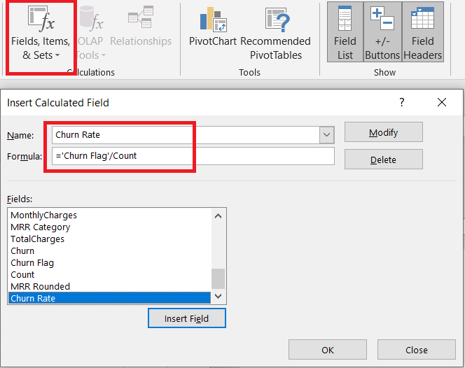
The beauty of this field is that it would run sums of Churn Flag and Count before doing the calculation when you run it. Honestly, it’s magic!
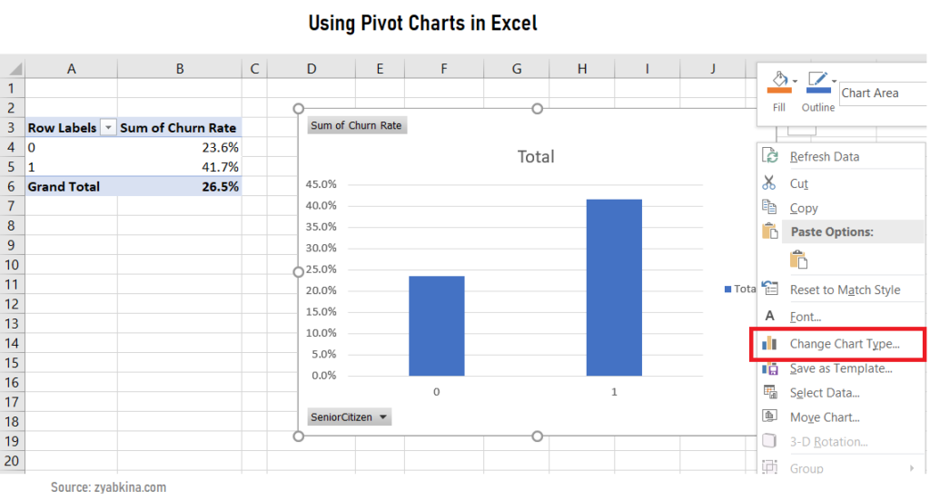
Use pivot charts to quickly gain insights
Once you created the churn rate field, start exploring the data. On the Analyze ribbon, there is a Pivot Chart that lets you add an instant visualization to your pivot. Choose your desired chart type in the Insert Chart window, and if you want to change it, just right-click anywhere on the blank space of the chart, and choose Change Chart Type.
Step 2. Use Lookups to Bring Additional Data
If you have any additional data that you want to join into your existing dataset on a specific field, you can bring it in using the VLOOKUP() function. If you are familiar with SQL, VLOOKUP() with the exact match option is similar to a left join.
I used VLOOKUP() function to turn the Monthly Charges metric into a categorical variable. In this case, I used a range lookup, or non-exact lookup. Basically, it triggers a match when the value you are checking (Monthly Charges) is equal or greater than the lookup value (lookups tab, column A), but less than the next value.
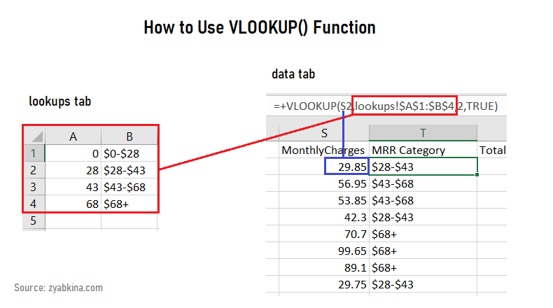
The range lookup is triggered by putting TRUE at the end of the formula. The exact lookup, indicated by FALSE, is going to look for exact values, and if it does not find them, it will return #N/A.
Step 3. Create Compelling Visualizations
Here are examples of some great visualizations you can make from this type of churn data. The goal is to illustrate the relationships between an attribute and the churn rate.
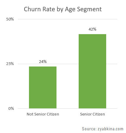
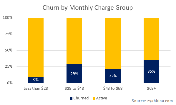
Churn Rate Split by an Attribute
You can split the churn rate by the attribute and display it as a bar chart.
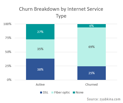
Stacked Churn Status Split by an Attribute
Or you can display it as a stacked bar, with the churn percentage highlighted.
Attribute Split by a Churn Outcome
Flipping the rows and columns in the stacked bar gets you to the breakdown of the outcome by the attribute.
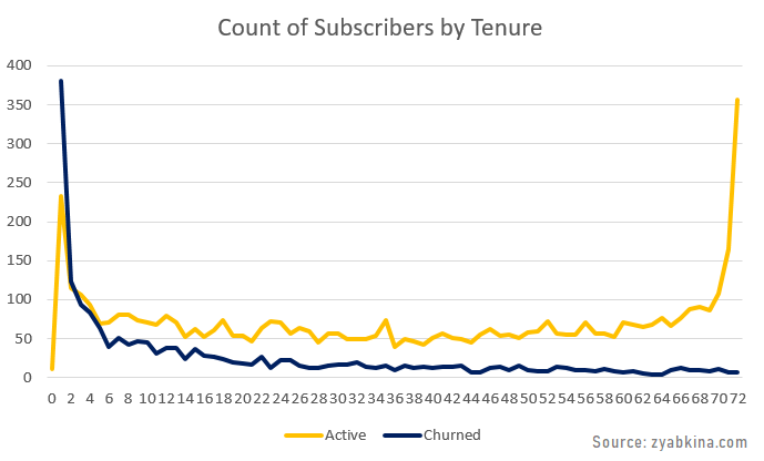
Continuous Variable vs Churn Outcome
If you decide to show continuous variables, then simple line charts are your friends.
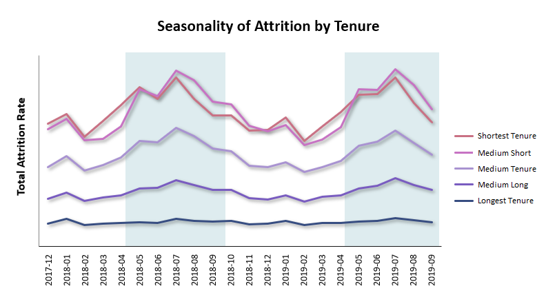
Trends Over Time
The last example is very important, and unfortunately, Kaggle data does not have this variable in their dataset.
Churn tends to be seasonal, so looking at the variables that make churn most seasonal is important. It is also important for reporting and KPIs because oftentimes you want to compare churn on a year over year basis.
Here is a typical example of seasonally and tenure relationship to churn. This chart was also created in Excel.
When You Have Too Much Data for Excel to Handle
The Kaggle case study has only 7K subscribers. However, many subscription businesses have hundreds of thousands if not millions of subscribers. If you are looking for 24 months of data for 100K subscriber business, then you will have 2.4M monthly snapshots, and using Excel is not possible.
Except, it is.
All you need to do is to summarize the data. Kaggle dataset was built on an individual subscriber level, e.g. each record is one subscriber/month. However, it does not have to be this way.
Once you have your most important categories for churn, you can summarize your data by producing a table with the count of churned customers and total subscriber count in each category, which would correspond to our Churn Flag and Count fields.
You would need to pay attention to continuous variables, such as tenure or MRR, which you would either need to convert into groups or run the averages when summarizing.
Conclusion and Next Steps
There are many data solutions that let you handle churn analysis, and Excel is definitely one of them. Widely available and used by many corporations, it offers great options for digging into the data.
Pivot tables and charts are particularly nice ways to summarize, slice and dice, and visualize churn data. With a few helpful tips, you will be well on your way to a better attrition analysis.
What is next?
Read about how to understand and interpret the data you are likely to find while analyzing churn.
Want to get into advanced analytics and create a churn propensity model? Read about churn propensity models and how you can leverage them to improve business decisions.
Need to go directly to churn reduction? Learn how to transform your business with data-driven churn reduction strategies and stop targeting the wrong segments.