
In this article, I draw on my experience as a Director of Retention Analytics for a leading US cable company to explain different types of churn analyses and how to interpret them. I will use data samples from Kaggle and simulate my own data similar to that of residential telecommunication services.
Churn analysis is a review of a company’s former customers that reveals their composition and trends. It looks for correlations between customers who became inactive during a period of time and variables such as tenure, product holding, service calls, seasonality, and demographics.
Now, let me show how it’s done.
When analyzing churn, the best practice is to put churn in context, so that the receiver gets an insight into whether the churn is high or low compared to historical data, and better understands what is driving churn, and how much.
First, let’s define what customer churn is.
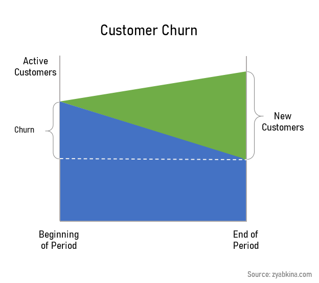
Customer churn is a change of customer status from active to inactive during the analysis period of time. In the telecom industry, churn is often called disconnect.
If you are having trouble defining churn, I wrote a very detailed explanation of how to calculate it here.
For the purposes of this article, I will use a simplified definition of churn that does not include disconnects from customers who had connected since the beginning of the analysis period.
Customer churn rate is the percentage of customers who have gone from active to inactive during the analysis period. The denominator for the churn rate is the number of active customers at the beginning of the period, and the numerator is churn.
Types of Churn Analysis
There are two types of churn analysis that are performed in Excel:
- cohort analysis
- attributes of churn analysis
Cohort analysis looks at subscriber survival from the initial connect and over time. It can be approximated by the tenure analysis, and it’s the first step in your understanding of customer churn.
Attributes of churn analysis studies customer-specific variables to find the attrubutes that are correlated with the churn rate. Attributes or drivers of churn analysis is widely used across subscription industries.
In this article, I will go over the attributes of churn analysis.
Customer Churn Analysis Steps
- Prepare churn and active customer data. If you track churn reasons, separate them into their own columns.
- Add explanatory variables or features to your active customer data. These variables usually include tenure, subscription type, pricing, service and call history, and demographics.
- Summrize the data and calculate churn rate for each period.
- Look for relationships between churn rates and explanatory variables. For categorical variables, split your churn rate by category. For continuous variables, look at the nature of the relationship.
- Convert continuous explanatory variables into categories that make sense.
- Find the most meaningful impact variables and develop reports and KPIs based on them.
- Don’t forget about seasonality. Most churn is seasonal and comparing churn rates year-over-year yields additional insights.
Now let’s go over these steps in detail.
Data You Need for Churn Analysis
Churn and Subscription Data
Churn is seasonal, and my suggestion is to use ~2 years’ worth of data for the analysis. You need two types of data:
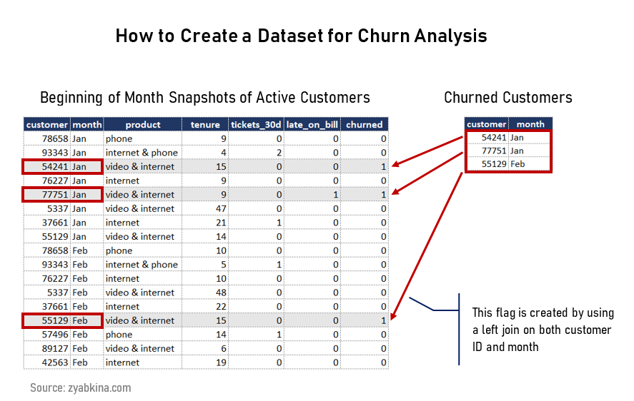
- Churn data. All of the customers that went from being active to inactive during the analysis period.
- Active customers data, i.e. a snapshot at the beginning of the period. This needs to be at a customer level so you can add other variables to it.
Most churn analysis is done on a monthly level, however, weekly or quarterly groupings are not uncommon. To cover 2 years of monthly data, you would need 24 snapshots and churn data covering the whole period.
Customer Variables
Customer data needs to be joined to the active customer snapshot data, and it should reflect customer status at the beginning of the period.
For example, if a customer turns 7 months of tenure during the month of January, they should be marked as 6 months of tenure for the January analysis because that’s what their tenure was at the beginning of the period.
Customer variables can be grouped into two types, internal and external. Internal data is generated during the course of the customer relationship. It is the most important data for churn analysis. External data are usually purchased from data aggregators, with some free data available directly from public sources.
Data from internal sources:
- Product or service the customer is subscribing to. If the customers are able to subscribe to multiple services, then segmenting the customers by major product groups or bundles makes sense. For example, cable video service plus internet service is a popular bundle.
- Tenure. Customer tenure is the length of time since the beginning of the customer relationship. It is an extremely important variable in churn analysis. I will talk about it in detail later.
- Changes to the product or service prior to the snapshot date. These are usually bellwethers of more changes to come, and thus correlate to future churn levels.
- Channel the customer connected through. Different types of customers self-select into different channels.
- Service outages, tickets, and workorders. Customers like their services to work well. Issues with the service can result in an increased level of churn.
- Product usage. How and how much your customers use your product. Please note that there could be privacy restrictions on which usage data you are able to analyze.
- Payment history. Being late on the bill is a big indicator of future churn.
Data from external sources:
- Demographics. The staples of demographic data are customer gender, age, education, and income. However, for many subscription services, variables related to transitivity or propensity to move are also important. These are variables such as the time at residence and homeowner status.
- Competition. Many residential subscription services are limited to a particular geography. Understanding which competitor services are available to the customer is an important variable.
How to Structure the Tables for Churn Analysis
I would recommend adding the churn data to the active customer snapshot data to create a flag indicating that the customer churned in the period following the snapshot.
For example, if you run your snapshot for the beginning of January (also known as the end of December), then you should create a flag that indicates churn in January.
Exploratory Churn Analysis
Now that we have the data, let’s analyze it. The goal of the exploratory customer churn analysis is to see which customer variables correlate to higher churn rates.
For this part, I used the Kaggle telco churn dataset and quick analysis in Excel using pivot tables and charts. I wrote a separate post on how I did the analysis here. This dataset is not truly representative of real churn data, but for the purposes of the exploratory churn analytics, it will do.
Churn Analysis for Categorical Variables
All you need to do is slice your churn rate by the customer type, and see if you are getting a difference in rates. You are looking for variables that produce charts with the most difference between your groups.
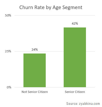
In this [totally unrealistic] example, Senior Citizens have a higher churn rate at 42% than non Senior Citizens, who have a churn rate of 24%.
Another way is to compare the composition of segments by the outcome. Here is an example.
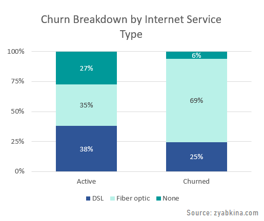
You can see how Fiber optic service is over-represented among the churned subscribers, while those without internet service are under-represented.
Converting Continuous Variables into Categories
Continuous variables like tenure and revenue are common. The relationship between the churn rate and these values is often not linear. If that’s the case, then it makes the most sense to break the variable into buckets and turn it into a categorical dimension.
Categorical variables make it easy to create KPI reports, especially, when you need to compare multiple geographical areas and timeframes. If the relationship is complicated enough, then using categorical buckets is also preferable for predictive modeling.
When you convert a continuous variable into categories, you need to keep areas of similar performance together. If you have churn differences by reason or segment at particular values, split them so you can keep similar churn levels together.
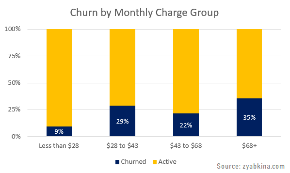
Here is an example of churned vs active subscribers by monthly charge, which is also called MRR, i.e. monthly recurring revenue in the industry.
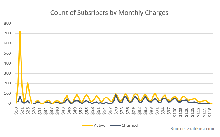
I split this variable into the following buckets: [0-$28), [$28-43), [$43-68), and [$68+), and you can see differentiation in the churn rate among the groups below:
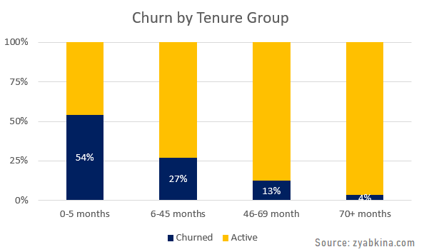
Another great example of converting a continuous variable into category groups is tenure.
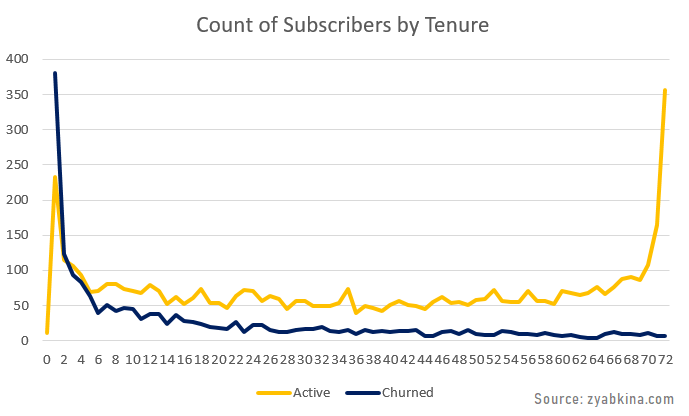
Based on my experience, the relationship between tenure churn depends on the churn reason, and it is a bit more complicated than this data presents, so it makes a lot of sense to use categorization.
If you want to see how I created these charts using nothing but Excel, here is a very detailed explanation, and it even includes a video of the process.
How to Interpret Churn Analysis Results
One of the most important things to understand about churn analytics is that different customer segments have inherently different churn rates. This has huge implications for every type of churn analysis, and it is the main reason why churn data gets misinterpreted.
Demographics usually drive customer segments, but in churn analysis, one of the best ways to create segments is through tenure.
Churn by Customer Segment
Let’s consider a hypothetical subscriber business that has two customer segments with vastly different churn rates. Every month, the business experiences 1,000 disconnects of subscribers who have an average time to disconnect of 6 months (short term segment) and 1,000 subscribers with an expected time to disconnect of 5 years or 60 months (long term segment).
If your expected customer lifetime is five years, then on average, a group of such customers churns at 20% a year or 1.7% a month. If your customers’ expected lifetime is 6 months, then their monthly churn rate is 16.7% a month.
This is a typical monthly churn report broken into these two segments:
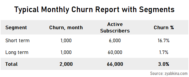
Note how much larger the active base for the long term segment is. This is due to the fact that these subscribers keep the service for longer, so with the same number of disconnects, you have a larger base.
Short term customers are only 9% of the active customer base, but they are over-represented among disconnects, where they are 50%.
Think about it this way, who has a higher likelihood of connecting/disconnecting, those who stay with their provider for five years, or those who switch every 6 months?
The high switchers are often targeted for both acquisition and retention because they have a high connect as well as a disconnect rate. However, with low expected tenure to disconnect, they have a much lower lifetime value compared to less “churny” segments.
Tenure in Churn Analysis
Unlike my theoretical example of having two clearly defined subscriber groups, the real-life customer segments are often latent. This is why including tenure in the analysis of churn is so helpful. It lets us quickly sort subscribers into the high and low expected tenure buckets.
Slow churning subscribers tend to congregate in longer-tenured active customer buckets because fast churning subscribers have disconnected already.
I ran a quick simulation of the active customer base for our hypothetical two-segment scenario, and the results look pretty representative of a real-life subscriber dynamic. Here is the active subscriber base by tenure group and segment (as defined above).
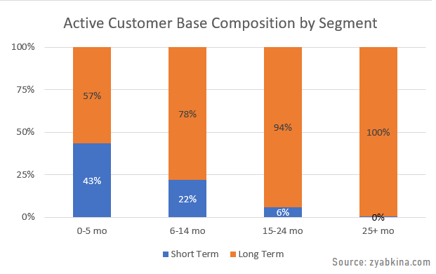
If you are looking at a group of subscribers with tenure over 2 years. Very few of the short term subscribers are going to make it to this group, and you are naturally going to be left with customers who have a longer expected lifetime.
The table below shows the summary of median and average tenures for both active base and churning customers that got in my simulation. I am citing it here because these metrics are often cited with little context, and it is really hard to tell if an average tenure of 8 years for an active customer is good, bad, or even meaningful at all.
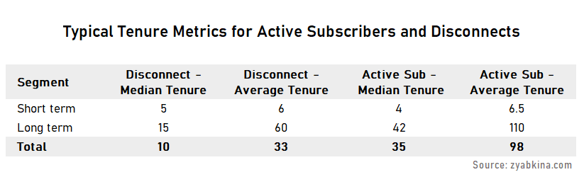
This dynamic produces interesting results that have many business people puzzled. Namely:
- Your active customer base is going to have a longer tenure than that of disconnects. This is a direct consequence of the fact that customers who stay longer tend to be over-represented in the subscriber base and under-represented in churn.
- Your medians are going to be much shorter than averages.
Churn Reasons
The reasons for churn are an important factor in the analysis. The data about churn reasons is not always 100% reliable, but it packs a lot of directional information that cannot be overlooked.
There are three main types of churn by reason in residential telecom:
- Voluntary
- Move
- Non-payment
The voluntary churn is a collection of different drivers that can further be split into reasons related to product/service, pricing, and competition. It is often hard to split this reason further, but isolating and understanding voluntarily churn in total is a good idea.
While it is presumed that most voluntary disconnects end up with a new service at a competitor, some churners completely stop using the service, for example, when a consumer switches from cable to internet video or from fixed-line phone service to mobile.
Move churn is often associated with younger and more mobile customers. If you have a demographic profile of your customers, then the length of time at the residence and being a renter are good predictors of future moves.
For reporting purposes, splitting the churn by reason makes a lot of sense. You should also compare the churn numbers on a year over year basis because move and non-pay churn tends to be seasonal.
If you are doing predictive modeling for churn, then in most cases, you would have to create separate models for different churn reasons because the drivers and thus significant independent variables are different by the type.
Product Line Churn
Multiple product lines, especially if they are not mutually exclusive may present challenges in analytics. There are two ways to analyze churn in a multi-line business:
- Product churn, which looks at the disconnect of a particular product whether it’s a full relationship churn and product drop. In this case, your total number of active subscriptions is larger than the number of individual subscribers that you have.
- Customer product group churn. Grouping subscribers into unique product combination segments, and then tracking them on a relationship level. For example, video and internet service would be one of those groupings. In this case, the total number of subscriptions is equal to that of unique subscribers.
When creating the product groupings to put customers in, you can make several levels of roll-ups that offer different degrees of detail about the product. However, your highest level of rollup is usually the most actionable.
Churn and Customer Lifetime Value
Customer lifetime value is the total profit the customer brings over their active lifetime with your service. If you are trying to figure out the lifetime value of an active subscriber, then the metric that makes the most sense is the residual lifetime value, i.e. the value of the remainder of the customer life with you.
To calculate lifetime value, we multiply profit from the expected monthly subscription fees by the number of months the customer is expected to be active.
The expected tenure of a customer in any given segment is inversely proportional to the churn rate, as the expected lifetime in months is 1/(churn rate), if using the monthly churn rate.
Therefore, for customers with similar monthly revenue, lifetime value is the opposite of their churn rate. The segments with the higher churn rates have lower lifetime values, and the segments with lower churn rates have higher lifetime values.
One of the implications of this simple notion is its impact on targeting strategy. I often see companies trying to try to retain high lifetime value customers who are most likely to churn, a group that mathematically does not exist.
The flip side of it is the high lifetime value customers who are likely to switch service. Again, these are rare unicorns, and companies need to double-check this approach for correct math before implementing it.
Advanced analytics can find instances when a low churn customer has a spike in switch propensity that can be leveraged. However, most companies are not sophisticated enough to find and exploit this opportunity, and their high propensity targeting efforts end up targeting low lifetime value customers.
Churn Reports and KPIs
Once you have done your exploratory churn analysis and understand important data breakdowns, it’s time to create churn reports.
Your reports should give the reader a clear idea of what happened to the churn in the last few periods, whether it is typical based on seasonality, and if it is not, what were the drivers or related variables.
To account for the impact of seasonality, you should always provide more than one year of churn analytics.
I would recommend splitting the churn reports by churn reasons, as those usually have different drivers as well as seasonal components.
The breakdown by the most impactful variables, such as churn, product segment, and possibly demographics is usually valuable.
For example, if your offers drew a lot of new subscribers in the last couple of months, you should expect to see elevated levels of churn because shorter tenure customers tend to have high churn rates. If you split your reporting by tenure group, this dynamic will be apparent.
How to Leverage Churn Analysis Beyond Reporting
One of the beauties of this type of analysis is that you can leverage it in other analyses throughout the company. For example, after I had analyzed the relationship between tenure and churn and established tenure buckets, I was able to apply them to any other analyses that had unbalanced tenure groups to make sure all of my comparisons are representative.
The same goes for any other variables that you find to be associated with the churn rate.
Every time you look at the results of a program that aims to reduce subscriber churn, it needs to be compared to a representative baseline. To make sure your baseline is representative, you need to make sure you match your program customers to a similar (in terms of disconnect propensity) group of customers.
This is why knowing the variables that impact churn is so important. You can split your program results by these variables and re-weigh them to create matched comparisons.
Common Errors in Churn Analysis
There are some mistakes in the churn analysis that I see often.
- Not having a consistent definition of churn, i.e. changing the definition month to month. There are some aspects of churn that can be interpreted in different ways. For example, subscribers who transferred service may or may not be included in churn numbers depending on the approach. Unfortunately, this churn metric sometimes gets changed to fit an agenda.
- Splitting churn into long periods of time for analysis, i.e. annual churn, not monthly churn. I discussed the churn rate and attrition rate definition in this article. For churn analysis, we want to stick with the simple definition (aka attrition rate), so you don’t have a significant number of “round trips” during your analysis periods, as you generally won’t be able to include these subscribers in the analysis.
- Not taking tenure into account. Many companies are aware of the relationship between churn and tenure, but they have not analyzed it well enough to understand the relationship and balance churn by tenure.
- Looking at total churn numbers and not churn rates. Calculating churn rates requires calculating active base numbers for every period. This complicates analysis. However, the rates are extremely important and should be used whenever possible.
- Presuming that a segment that has a higher churn rate is shrinking. I see this a lot in the product segment, i.e. our highest churn rate is among customers who choose only product A, which means we are losing them. This is not correct. Your dynamic for the segment is defined by both connects and disconnects.
- Not realizing that a higher churn rate means a higher connect rate and vice versa.
- Trying to consistently target customers to have a high lifetime value and high propensity to churn or connect. There is more depth to this area, but as described in the lifetime value sections, this is not a sustainable approach.
Conclusion
I have done a lot of analytics in my life, and churn analysis never disappoints. It is one of the most fascinating projects, every time it comes up. It produces very rich data, uncovers some obvious and some not very obvious relationships, and layers of insights.
If you feel like your company has not done the heavy lifting on customer churn, it absolutely pays to dive in. From defining segments to figuring out which drivers have the most impact, you are up for an amazing journey.
Once you complete the churn analysis, the next step is to dive deeper, into churn propensity modeling and figuring out how to reduce churn using analytics.
To learn more about propensity to churn modeling, please read this article where I explain the modeling process, and it should and should not be used for churn reduction.
The end goal is to help the company make better decisions, and improving customer retention is certainly a great way to build and grow a stable sustainable business.
If you want to discuss your churn analytics further, please connect with me on LinkedIn or send a message.